

Table of Contents
1. Why most brands get color wrong — and don’t realize it until it’s too late
Most people think they’re picking a “nice-looking color.”
But here’s the truth:
When you choose color without thinking about brand strategy, you’re not just picking a shade — you’re silently changing how people see your product.
Imagine these two situations:
You’re a performance skincare brand, but you’re using soft pastels. Customers think you’re selling aromatherapy.
You’re a plant-based gentle brand, but you’ve gone with shiny white + hot pink + chrome. People assume it’s cheap, fast fashion skincare.
🎯 Customers don’t wait for your explanation. They judge based on what your colors say.

2. Before picking any color, ask yourself these 3 questions
In every project, we guide clients through these 3 questions first:
What emotion do you want your packaging to create at first glance?
Who are your target customers, and what color tone fits them best?
What’s your product focus — natural, professional, healing, premium?
📌 Color is not just aesthetics — it’s a strategy. If you answer these 3 honestly, you’re already ahead.
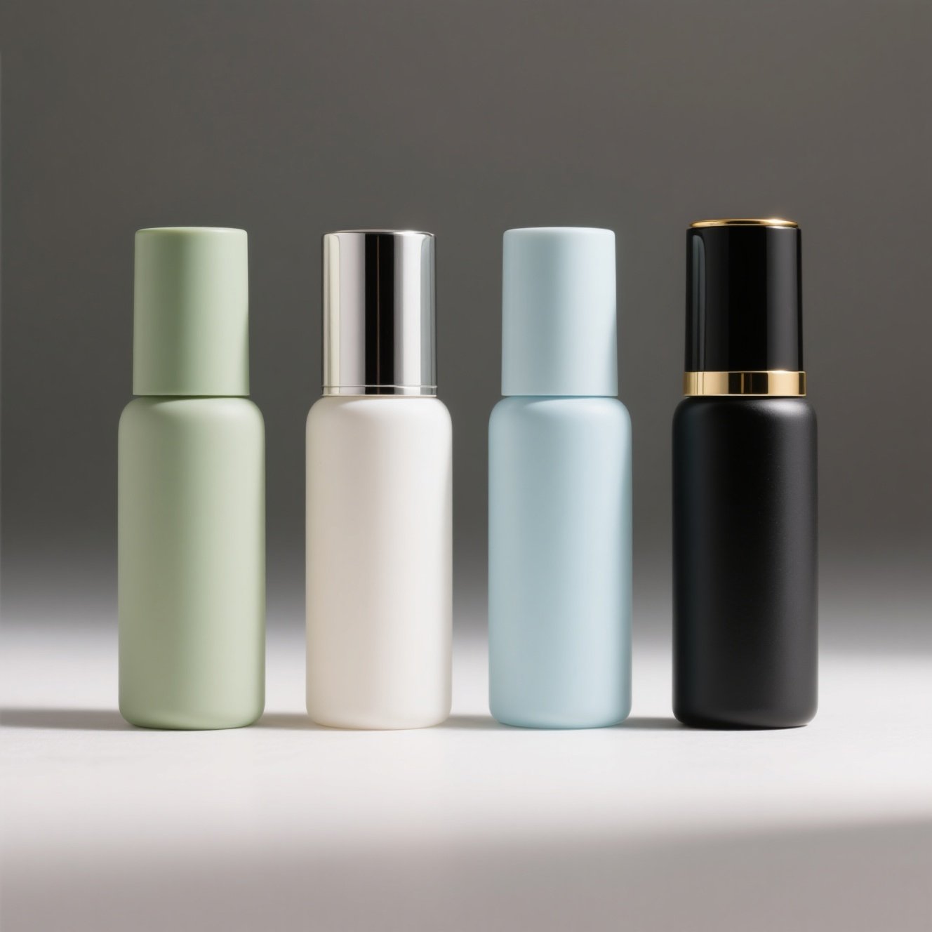
3. A strategic guide to color zones by brand type
Here’s what we’ve seen work best after over 100 skincare color projects:
| Brand Style | Main Colors | Suggested Pairings | What to Avoid |
|---|---|---|---|
| Daily Fresh | Mint green / Mist blue / Cream gray | Off-white + Dusty pink / Soft wood tone | High-saturation contrast |
| Science-Driven Skincare | Matte navy / Ivory / Soft black | Cool gray + Electroplated silver | Candy colors |
| Botanical/Natural | Matcha green / Almond beige / Milk coffee | Deep wood + Butter white | Full black |
| Healing/Emotional | Lavender gray / Soft orange / Blush pink | Peach + Dusty blue | Metallic chrome |
| Premium/Modern | Ivory / Warm taupe / Smoky beige | Electro black/silver details | Bright greens |
✅ Don’t just pick a color. Match your tone, message, and future line extensions.
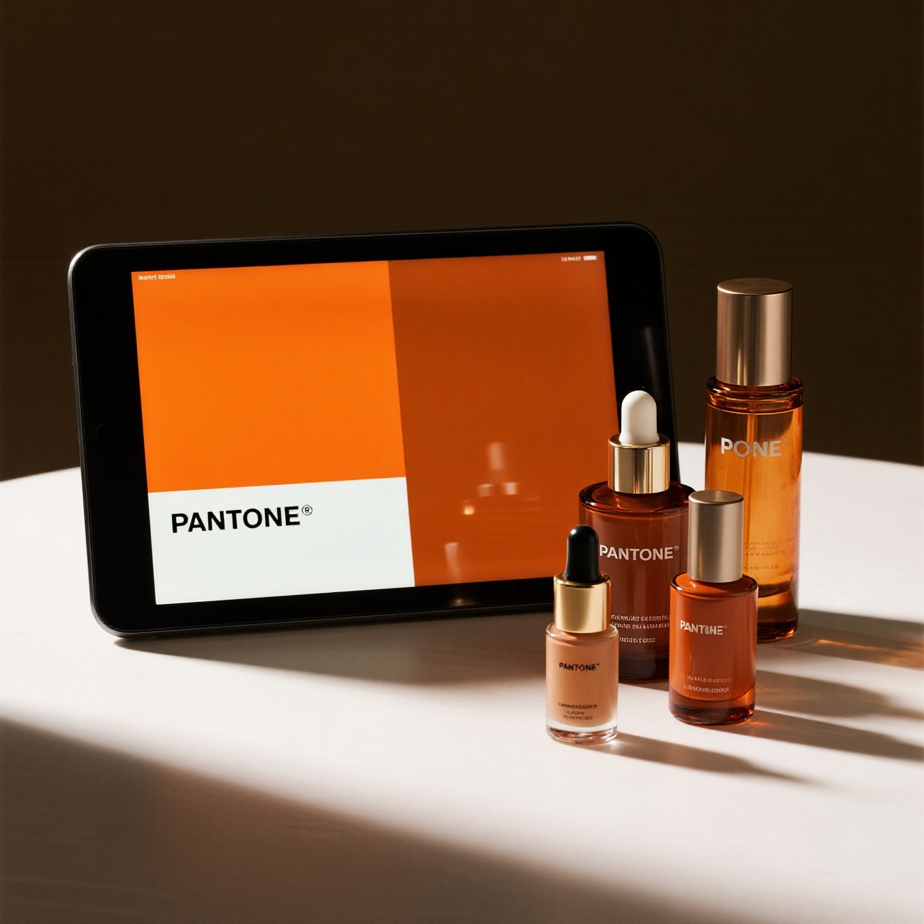
4. Why Pantone looks great on screen but fails in real life
One of the biggest mistakes we see: picking a beautiful Pantone online, and hating it once it’s sampled.
Why?
Different base materials absorb and reflect differently (PET, PP, glass, electroplating…)
Surface finishes change color perception (spray vs. injection color vs. UV matte…)
Bottle shapes distort how color shows (tall bottles, flat bottles, curved structures…)
📌 Don’t rely on color codes alone. Always test with real bottle types or physical samples.
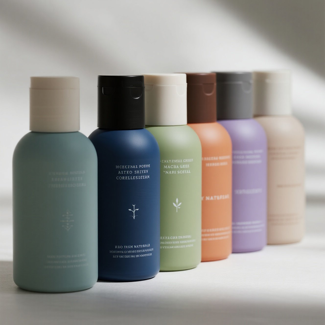
5. Build a color system — not just one color
The brands that get remembered don’t use “one pretty color.” They build a color system with clear logic.
🎯 We recommend the trio method: Main + Accent + Neutral
Main color: emotional anchor (usually the bottle)
Accent: adds contrast or mood (caps, pumps, outer boxes)
Neutral: balances and elevates (ivory, smoky gray, natural beige)
📦 Example: Cream gray main + Matte forest green pump + Dusty pink logo = way more brand feel than “all gray.”

6. Test before you commit — start with small batch color runs
We support:
5000pcs for full color customization
1000pcs for label/logo printing
That means you can:
Pick in-stock bottles
Spray test your brand color
Print test labels or match cap tones
Soft launch and collect real user feedback
👉 You reduce inventory risk, gain customer insights, and refine your look.
📩 Final thought: If your packaging doesn’t speak clearly, your customer won’t remember you
Don’t choose a trendy color. Choose one that truly speaks your brand’s language.
We help brands:
Build consistent color strategies across product lines
Match materials, bottles, print and cap finishes
Provide visual simulations and samples
Offer flexible low-MOQ color trials
✅ If your product is saying the right things, make sure your packaging isn’t saying the opposite. Want help? We’re here to guide, not just manufacture.